Updating a brand for new generations
Over time, a brand develops recognition and ‘brand equity’. If it is loved and respected, this is something you don’t want to lose with a random rebrand. It’s important to know what to change, and when, to keep your brand relevant and to retain continuity with the best of its past.
Lloyd Grey has nurtured a number of traditional brands through a reimagination. The solutions and levels of change have been different for each.
When evolution calls
Business author Alan Deutschman popularised the aphorism, ‘Change or die’. In this, he echoed Charles Darwin who said, ‘It is not the strongest or the most intelligent who will survive but those who can best manage change’.
In the branding world, even the best-known brands need to keep on their toes as their environment changes and new generations bring new tastes and perspectives.
Often, with a traditional or well-established brand, a branding consultant is treading on sacred ground, and major change may be seen as almost sacrilegious by some of the brand’s guardians.
Two Lloyd Grey clients demonstrate how the change may be subtle or may be much more transformative, depending on circumstances. In both cases, change was necessary to stay relevant.
100 years of education
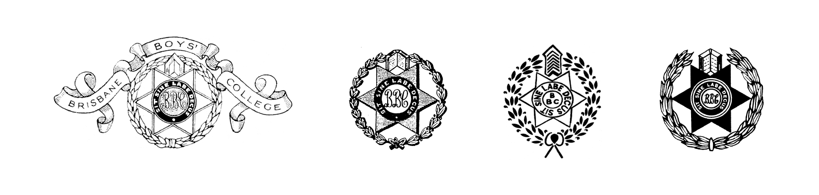
Brisbane Boys’ College had been educating young men for a century when it contacted Lloyd Grey, realising it needed to reposition itself to survive. Its prospectus and promotional materials looked badly out of date and didn’t reflect a forward-thinking and contemporary education. The history and tradition of the school were an integral part of its appeal but they needed to be presented in a more appropriate way.
Inevitably there were those who thought the school crest shouldn’t be touched. As part of its rebranding rationale, Lloyd Grey demonstrated how it could be simplified for clearer reproduction, at the same time retaining its meaningful elements and looking more contemporary for 21st century parents and students. In this case, an obvious visual continuity was the right solution.
The heritage was also beautifully represented by embossing elements of the architecture on important publications – in other words, the architecture became part of the brand.
The new brand touched everything from photography style (goodbye 1970s!) to stationery. A signature centennial book with the new brand and design won a commendation from Design Institute of Australia.


A transformation for a traditional charity
In contrast, the charity of the Queensland Freemasons’, which also had a long established brand (originating in the 1920s), needed to take a courageous leap forward from a name and logo that were no longer relevant to the scope of their work or the contemporary community.
‘The Board of Benevolence and of Aged Masons, Widows and Orphans’ Fund’ needed to rethink its approach to continue to raise funds and support many good causes in the community. The original logo of a dependent mother and children spoke of another time and a very different society.
When recommending a new brand with a completely new name and logo, Lloyd Grey was very keen to find roots in the Freemasons’ philanthropic traditions to retain the goodwill of the brethren around the state – but it also needed to be something that made sense to the wider community when it appeared at events like Bunnings sausage sizzles or on sponsored vehicles.
The new name Hand, Heart, Pocket reflects a Freemasons’ ritual of touching hand to heart and pocket to pledge help to those in need. It also symbolises to the public the practical help, empathy and financial support that the Freemasons give to Queensland communities.
The interpretation and colour of the new brandmark help it stand out in a competitive fund-raising field.
From there, Lloyd Grey created the look, feel and story to introduce the new brand to the brethren. A new manifesto, new website and new fundraising tools consolidated the change. In total, the brand transformation achieved a new identity that would boost fundraising and empower the organisation’s future.


The brand positioning has found a natural niche with the many people who care about the source of their food, about supporting artisan local producers and about supporting the arts.
It inspires people who like to share the best of Queensland with friends and visitors. It touches those who want greater connection with the land, even when they live in the city.
It creates an intricate web of mutual support based on the heartfelt concerns of its founders.
It brings a story of community and of timeless shared occasions to every glass and plate.
If you need help to refresh or reimagine a traditional brand, LloydGrey can find you a pathway that both retains valuable brand equity and also invigorates the brand with new energy for changing times. Contact us