Mother Meg's Fine Foods
TRADITIONAL BISCUITS, CAKES AND PUDDINGS MANUFACTURER
A timeless biscuit and cake brand that transformed a micro business into a global giftable
The challenge
Mother Meg’s Fine Foods began in a Toowoomba garage with a humble range of handmade biscuits, cakes and traditional Christmas treats. Despite their commitment to quality and home-style baking, the business faced a critical turning point: after losing a key contract due to underwhelming packaging and poor shelf performance, they needed a bold shift. The challenge for LloydGrey was to reimagine the brand from the ground up and create a cost-effective packaging solution that would reflect the product’s quality, attract new buyers and regain market traction.
A brand refresh steeped in tradition
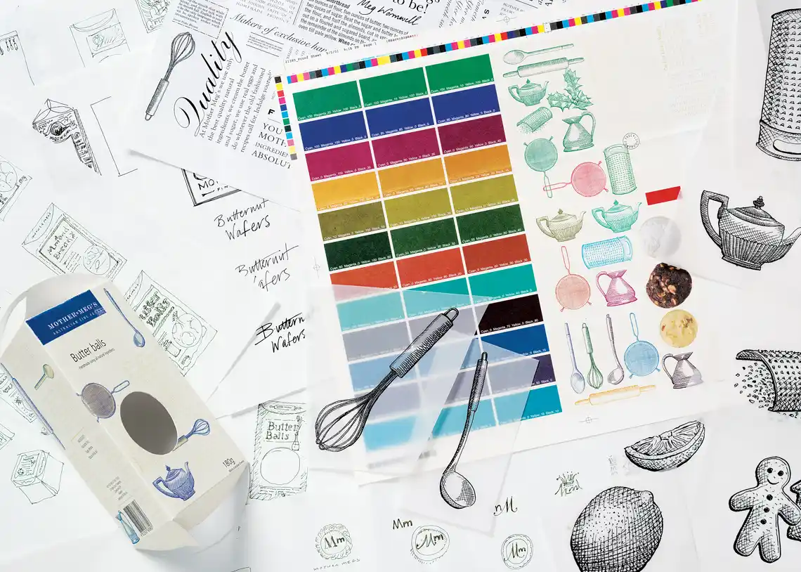
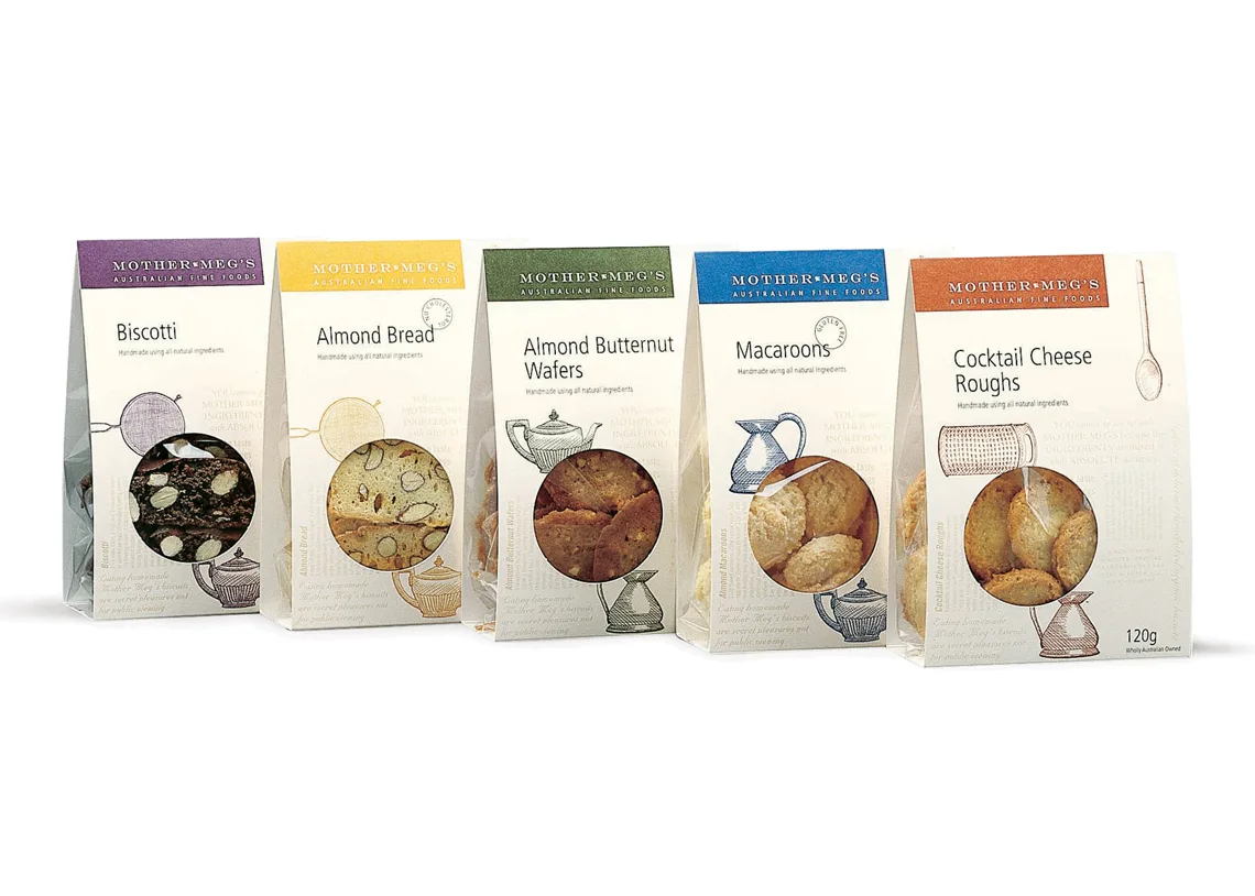
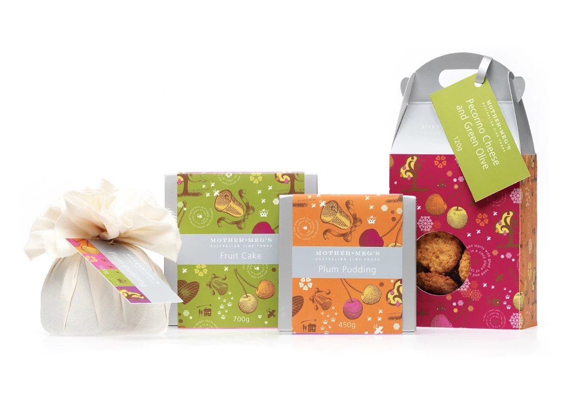
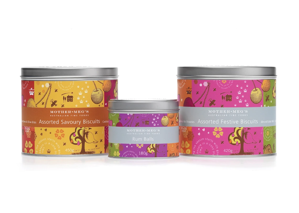
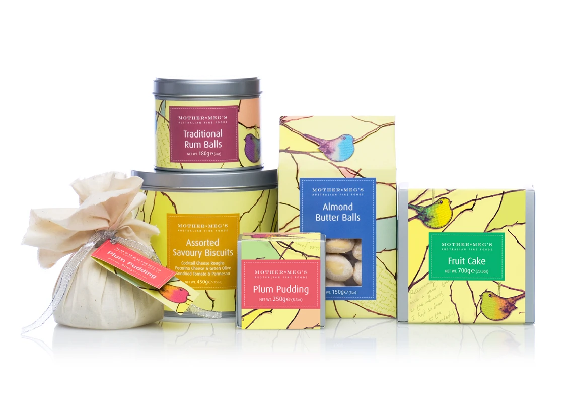
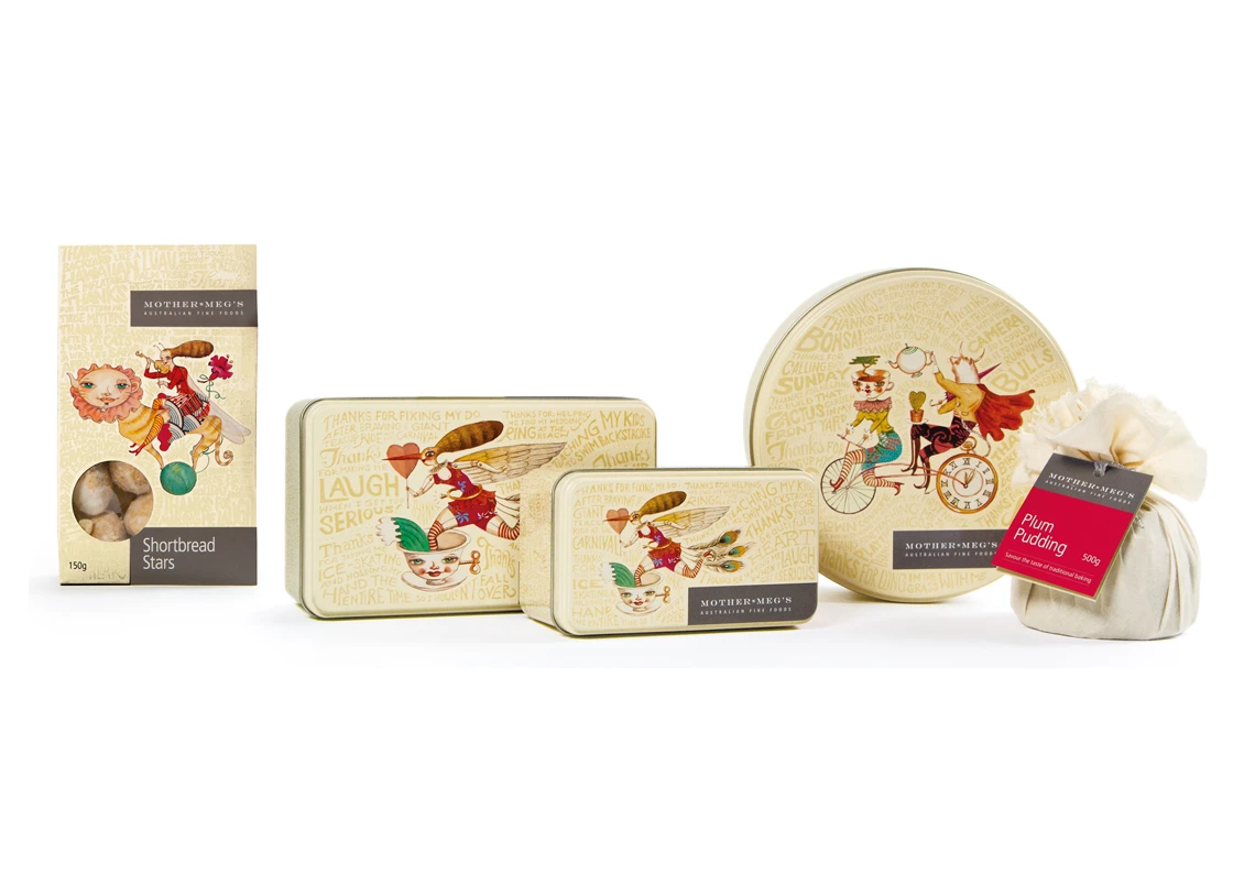
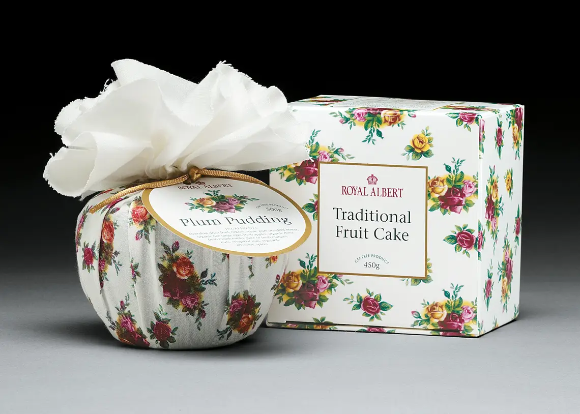
Our solution combined thoughtful storytelling with design elements that reflected the heart of Mother Meg’s values. We introduced a charming, heritage-inspired packaging system that featured hand-drawn illustrations of kitchen implements and warm, nostalgic typography. Distinctive colour palettes helped differentiate the product range while enhancing shelf appeal. Importantly, we chose an uncoated cardboard stock using the reverse side of a one-sided coated board—offering both tactile authenticity and significant cost savings compared to their previous glossy polymer packs.
Packaging that told a story – and sold
The revitalised brand gave Mother Meg’s Fine Foods an immediate point of difference. The new packaging struck the perfect balance between homespun tradition and upscale design—positioning the products as ideal gourmet gifts. The impact was swift and dramatic: within a short time, sales increased by 225%, and the business was back on track.
Results that travelled far and wide
The rebrand caught the attention of global retailers including Harvey Nichols in London and Raffles Hotel in Singapore. Domestically, major contracts followed with Myer Grace Bros, David Jones, and Country Road, as well as high-end grocers and delis nationwide. Even Qantas first-class cabins began serving their cookies.
A lasting design legacy
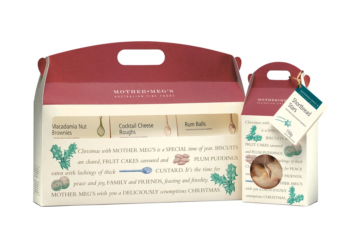
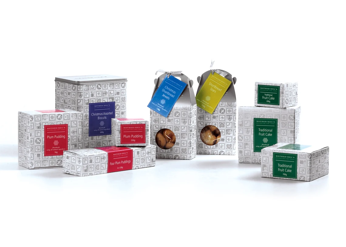
Since the first packaging design launched in 2001, LloydGrey has continued to support Mother Meg’s with seasonal ranges and brand evolution. The company has won multiple business and design awards, and the original packaging illustrations are still in use today. When the business was sold to new owners, its brand equity—rooted in the shelf appeal and design integrity—was a major part of its valuation. With continued global success, the brand remains a delicious example of how great design can elevate even the most modest beginnings.
"In the first financial year in which I launched the LloydGrey packaging, our sales rose a phenomenal 225% from the previous year. This sales growth...
Read more
Read more
… continued at 147% the following year. I have no hesitation in saying that their design was a critical factor in turning my business around.
“Today our client list incorporates some of the world’s most prestigious companies such as Raffles International, Harvey Nichols London, Qantas Airlines, Myer Grace Bros, David Jones, Royal Doulton, and Country Road. All of them inspired by the Mother Meg’s packaging, designed exclusively by LloydGrey.”
Owner — Mother Meg’s Australian Fine Foods


