B&R Enclosures
ENCLOSURE DESIGN, MANUFACTURING AND SOLUTIONS
Strengthening an Australian family brand by elevating quality, service and value in a tough price-driven manufacturing market.
Challenge: Competing in a price-sensitive market
B&R Enclosures, a multi-generational, family-owned Australian business specialising in manufacturing electrical enclosures and cabinets, was facing increasing competition from lower-quality imported products. As a result, the market was driven primarily by price, so the brand challenge was to communicate the superior quality, service and Australian-made credentials of B&R Enclosure’s offerings.
Solution: A rebrand rooted in quality and Australian heritage
LloydGrey led a comprehensive rebrand to emphasise B&R Enclosure’s strengths and values. To achieve this, the new brand identity needed to be instantly recognisable, reflecting the company’s Australian roots. The solution was a distinctive brand centred around a ‘BR’ monogram and colour palette inspired by Australia’s landscapes and diverse environments where B&R Enclosures are utilised. In addition, we introduced a powerful human-focused visual language to signify superior customer service and care.
A bold manufacturing brand identity and advertising approach
The ‘BR’ brandmark became the cornerstone of the visual identity, extending across all brand touchpoints. Utilising this, bold advertising campaigns were launched to highlight the company’s values and build a strong internal culture. As a result, this distinct approach has allowed B&R Enclosures to stand out in the utility sector, reinforcing their leadership position and unique benefits to key decision makers.
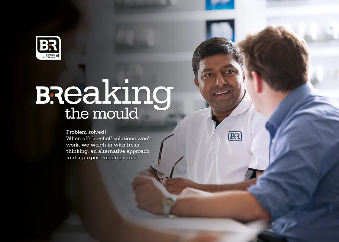
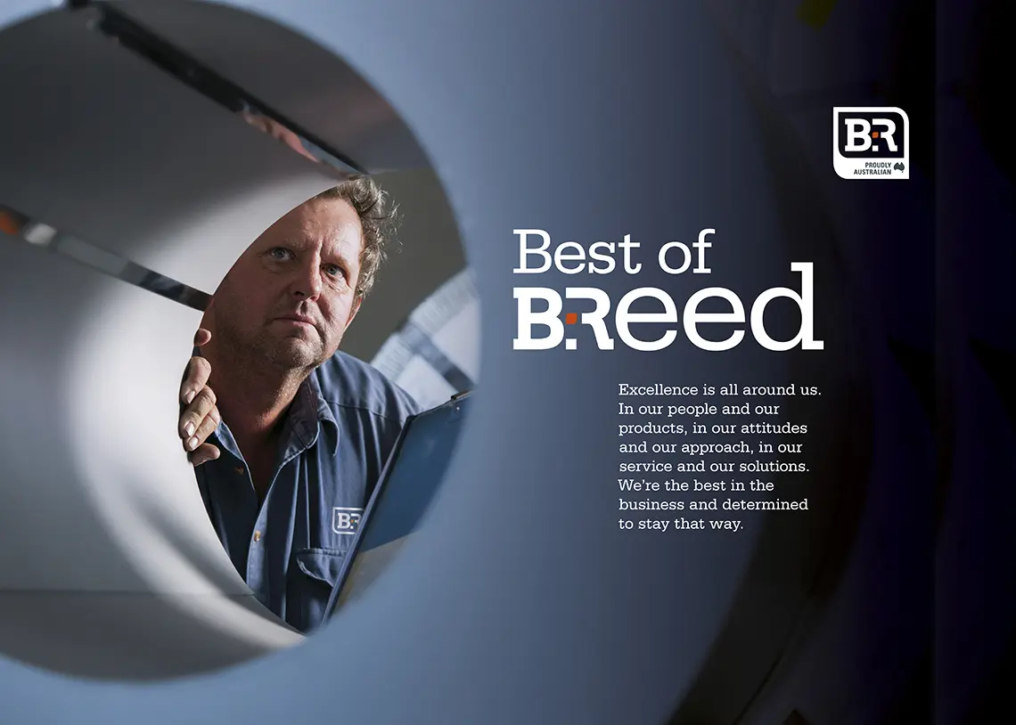
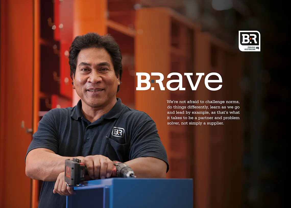
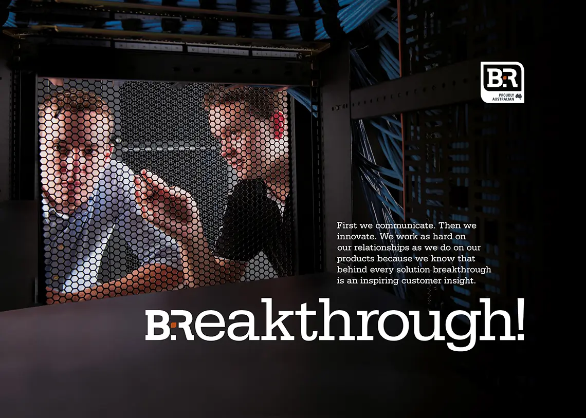
Human-focused brand photography
B&R Enclosure’s technical expertise, already evident in their products, was reinforced with LloydGrey’s photographic approach emphasising the people behind the company within the manufacturing environment. This human-focused visual storytelling highlighted B&R Enclosure’s role in the community and superior customer care, setting them apart from competitors who focus solely on product features and price.
Results: growing market share and global competitiveness
As a result of the rebrand, B&R Enclosures maintained pricing stability while increasing market share and competing effectively on a global scale. Throughout the process, LloydGrey was proud to support and collaborate with this Australian family business, to maximise their globally competitive position while maintaining their commitment to quality and community. First introduced in 2011, the rebrand has provided an enduring foundation for the business to grow from strength to strength, and is still used by B&R Enclosures today.
“We approached LloydGrey for a branding exercise because we didn’t have a cohesive brand position. They added most value by expressing our brand story. The process was very accommodating, we felt like there was an alignment and overall very good results.”
General Manager — B&R Enclosures
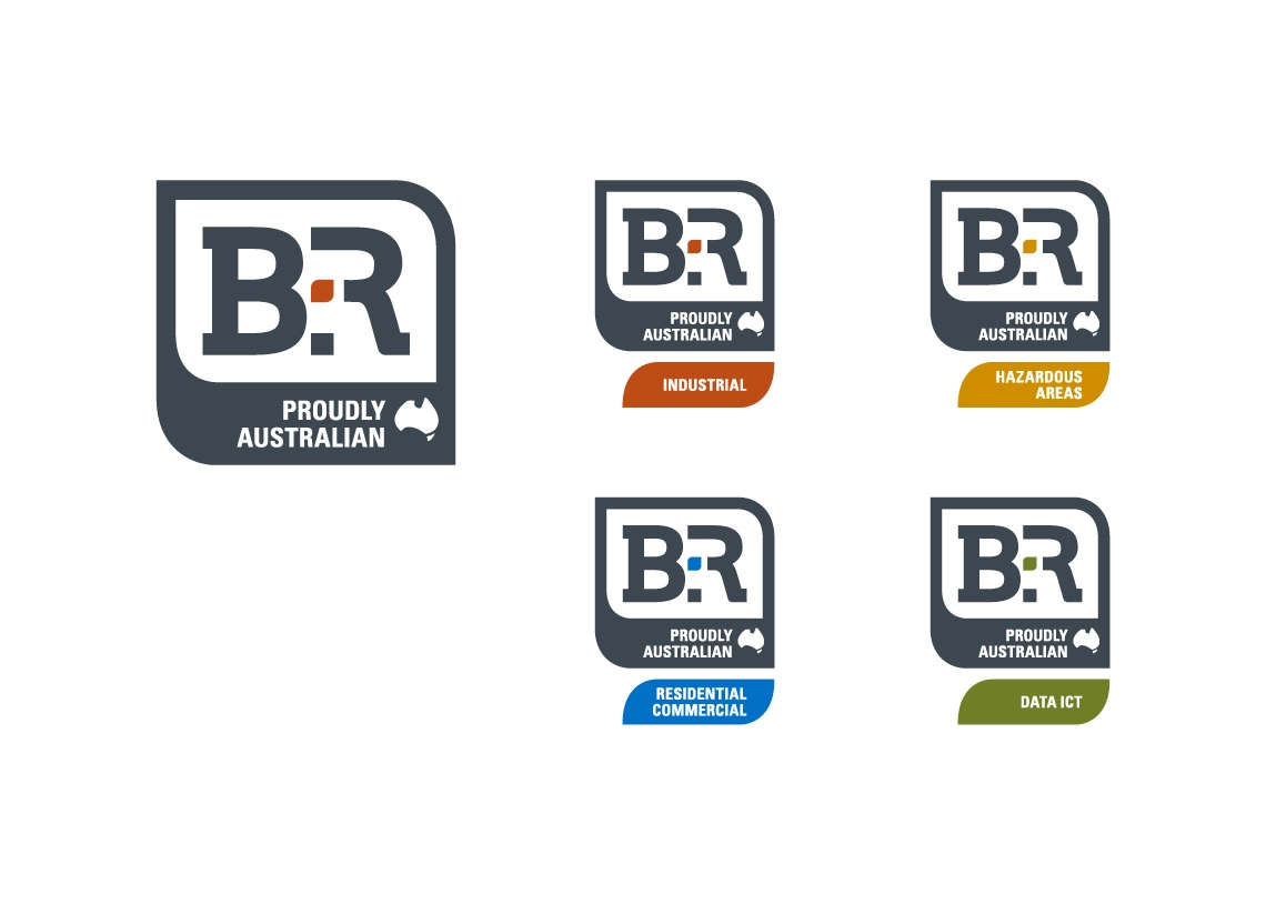
B&R Enclosures brand architecture
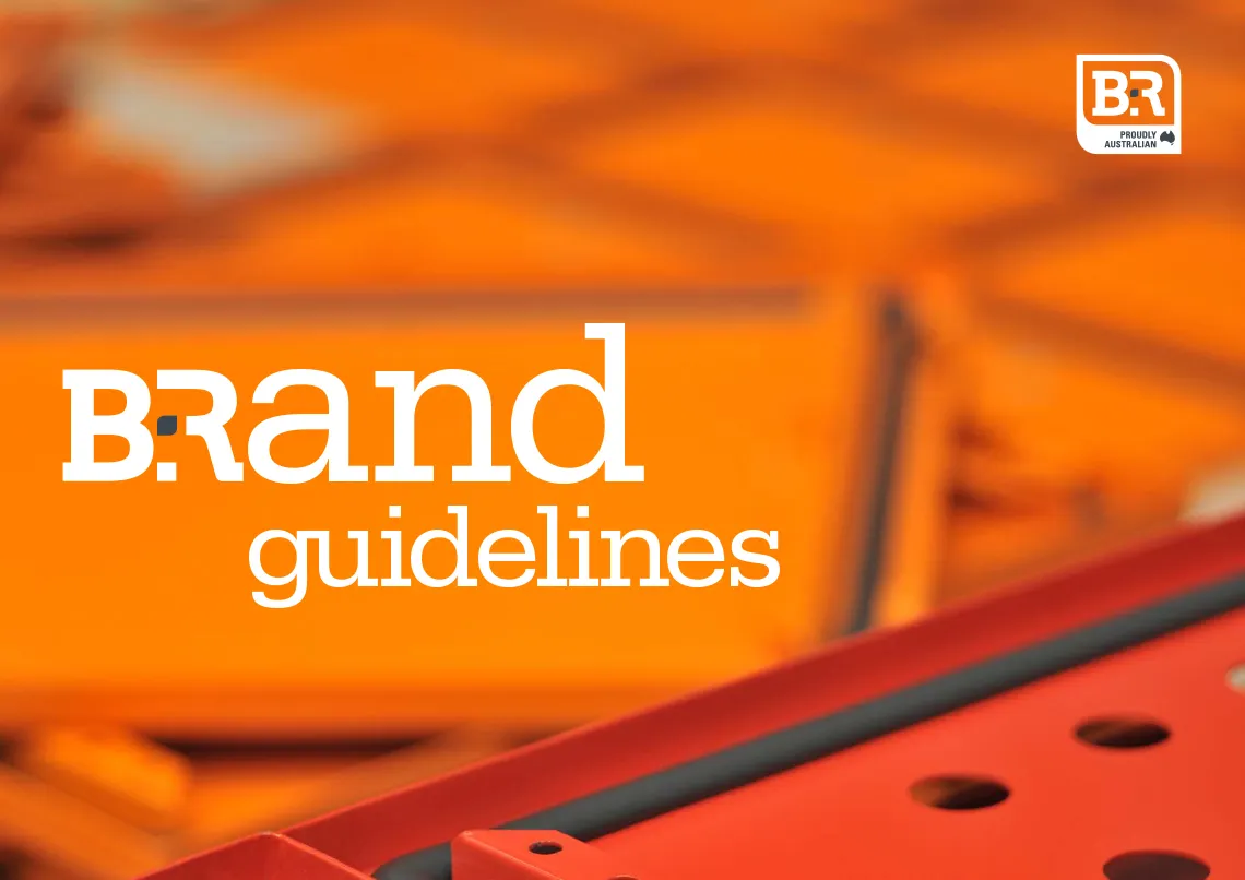
B&R brand guidelines
Industry brand awareness material
Brand awareness posters
Brand awareness posters
Brand awareness posters